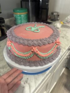
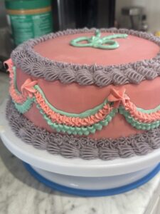
This week, I took my cake decorating to the next level by focusing on color! After practicing piping techniques last week, I wanted to explore how color could enhance the vintage aesthetic. Instead of sticking to an all white palette, I chose a soft pink base with piping details in pastel pink, lavender, and mint green.
Building on Last Week’s Techniques
I used the same decorative piping methods I practiced before—shell borders, ruffles, and draped garlands but this time, color played a key role in adding to the design. Choosing the right shades was more challenging than I expected, but with some help, it made a huge difference in achieving the vintage look.
Learning to Work with Color
I needed to know what was the best way to add color to delicate buttercream, so I turned to an article from Sugar & Sparrow. It offered some tips on coloring frosting. The article explained how different types of food coloring affect buttercream and how to layer colors gradually for the perfect color. The article suggested that the base color of the buttercream matters. I was rooting for soft colors so white was the perfect base. I used vanilla-buttercream as a base. I also learned that gel food coloring was the best for buttercream. I did not have any of that in my house, so I headed to Bulk Barn and got a red, a blue and a yellow. I learnt really fast that less is better when trying to achieve the pastel colors I was hoping for.
I really liked how the article offered lots of reading which is helpful because I like to read. They also offered a video as well which was nice too! I could watch and see exactly how to add color in real time.
Sugar & Sparrow was very helpful and I will definitely keep all the tips and tricks saved for my future cake decorating adventures.
The Impact of Color Choices
I learned color can completely transform the vibe of a cake. Last week’s cake had a more simple look, but this one feels much more eye-catching. The soft palate helped me enhance the vintage aesthetic without looking too busy.
ARE YOU READY?! Here is the final result. I am super proud!
Next week, I’m going to challenge myself by working with a rich/deep color palette. I want to see how bold colors can impact the overall design.
Wow, your cake looks amazing! The colours of the icing turned out nice and I bet they look even better in person!
Your cake looks amazing, Breanna!! The colours you chose are beautiful, and I like the way you layered the different piping techniques in the garland. I can’t wait to see what next week’s cake looks like!
I love the colours you chose! That colour scheme reminds me of old novels like Pride and Prejudice. Great job with your journey!
This is such a beautiful cake! It looks like the cakes I add to my Pinterest boards! I am excited to see your colour choices for next week!
I am so impressed!! It makes me want to learn how to do this. The colours kind of remind me and get me excited for Easter. Also, every time I read one of your posts I start craving cake. Does it taste as good as it looks?!
Your cake looks amazing! I love how you used pastel colors to enhance the vintage vibe. It’s great that you researched the best way to add color to buttercream, and the gel food coloring tip is super helpful. The soft pink, lavender, and mint green combo is beautiful, and I’m excited to see how you tackle bold colors next week! Keep it up!