Modern English Calligraphy vs. Persian Nastaliq: A Visual & Stylistic Dialogue
Introduction
This week, I’m stepping into the fascinating world of cross-cultural calligraphy by comparing two art forms I deeply admire: Modern English calligraphy and Persian Nastaliq. Though they come from vastly different linguistic and cultural traditions, both styles exhibit a fluid beauty, rhythm, and intentional artistry that transcend language. In this post, I’ll explore how these styles differ and align—particularly in their letter shapes, slants, connectedness, and overall composition.
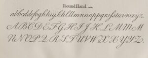
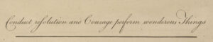
1. The Slant: Vertical vs. Diagonal Elegance
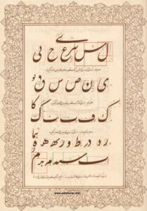
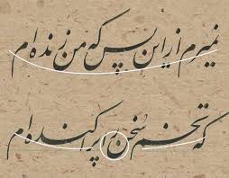
Modern English calligraphy, especially in cursive or copperplate-inspired styles, tends to favor a consistent slant—often around 52 degrees—which gives it a sense of forward momentum. Persian Nastaliq, on the other hand, leans even more dramatically, with letters cascading diagonally downwards to the right, forming beautiful diagonal baselines across the page.
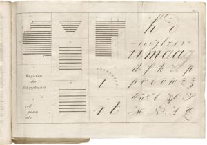
2. Letter Shapes: Structured vs. Curved Flourish
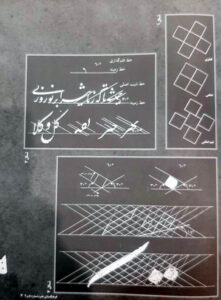
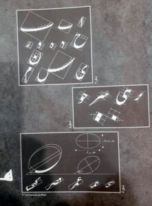
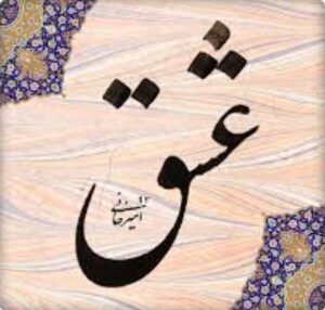
Modern English calligraphy letters are often tall and narrow, with defined ascenders and descenders. There’s a structured elegance, even when using more free-form modern scripts. In contrast, Nastaliq is known for its dramatic curves, compressed forms, and swooping descenders, especially in letters like “ی” (ye) and “ر” (re). The forms often resemble flowing water—organic and almost gravity-defying.
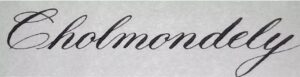
3. Connectedness: Ligatures and Flow
In English calligraphy, letters are generally individually formed but connected with flowing upstrokes or entry/exit strokes. Nastaliq takes connectedness to another level—ligatures are foundational. Words often appear as a continuous ribbon of form, with letters adapted to the shape and flow of their neighbors. The result is a script that looks like a single visual composition rather than separate characters.
4. Spacing and Composition: Linearity vs. Gravity
Modern English calligraphy generally follows a horizontal line, with even baselines and spacing. In contrast, Nastaliq allows letters and words to drop and climb, creating a sort of controlled chaos that feels like the words are dancing. This gives Nastaliq a musical and visual rhythm that shifts weight and movement across the page.
Final Thoughts
Both Modern English calligraphy and Persian Nastaliq express something deeply human: the urge to turn language into art. While their techniques, tools, and traditions differ, they each reflect a cultural relationship with beauty, communication, and the written word. Comparing them side-by-side has deepened my appreciation for both traditions—and reminded me that calligraphy is not just about writing letters; it’s about shaping meaning.
Have you tried writing in or practicing Nastaliq or any other world scripts? I’d love to hear your thoughts and experiences in the comments!