This past week we looked at OERs or Open Education Resources. I selected Ted Ed to review this week looking at the user-experience, organization, quality of resources, value to educators and value as an Open Education Resource. While I have accessed a few TED-Ed videos in my classroom I had not really explored the website fully before.
User Experience
 The logo TED Ed on the left hand side functions intuitively as Home in the Menu bar.
It is easy to search. The top menu includes Discover, Create, Get Involved, Support, Search and icons for personalizing one’s experience. Users intuitively associate discovery with the pull down options of learning or browsing new ideas whether they were lessons, or collections (thematic or topic based), explorations that might be a more interactive learning opportunity and Blog being a more in-depth view of content. Users do not have to guess where to click.
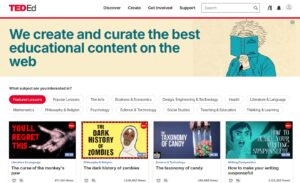
Visually the webpage is not cluttered. It is clean, the font and colour choices are intentional. If I hover over one of the subjects it turns red. Each of the thumbnails for videos clearly communicate the main idea, theme, with short readable titles. This consistent format across all videos is optimized for accessibility, ease of navigation, to be informative at a glance and to be aesthetically engaging. Below the thumbnail two icons a heart (add favourite) and three lines with a plus (add to collection) enhance the user experience by allowing users to revisit content, personalize their experience, and turn browsing into an active curation of content.
Organization (and my search for Kombucha)
 On the main home page users can search by subject. Each subject (Arts) further has a sub menu (Visual Arts, Performing Arts, Value of the Arts, Back). Subjects can be filtered by level (elementary/primary, middle school/lower secondary, high school/upper secondary, college/university), content type (animation, lesson, best of web) , video duration and subtitles (language). Subjects can also be sorted by options like featured, popular, newest, oldest etc. This makes content easy to find, narrow what viewers need, and help them locate relevant materials. It allows for flexibility and a the ability to control content. It can also support different learning goals and increase accessibility for multilingual learners.
As I am interested in kombucha I had to use the search function to see if I could find a video or lesson about kombucha. Surprisingly a video/lesson came up instantly, Are Food Preservatives Bad For You, and while not directly mentioning kombucha in the video I did see the word kombucha mentioned in the dig deeper section of the lesson. This suggests to me that the video search function is effective in using tag-based organization to link ideas that belong to the same category.
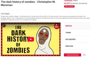
Each lesson is structured to follow the same format. Below the title is a short two to three sentence overview of the video. The side menu to the left of the video has the following options Watch (the video), Think (multiple choice or short answer questions), Dig Deeper (links to resources) and Discuss (questions to extend thinking). This is followed by a red box Customize this Lesson. When clicked the options laid out for customizing follow the same structure. This consistency or pattern in layout aids users in navigation and sets them up for success in customizing their own lessons.
Quality of Resources
Under the Menu Get Involved there are two selections that speak to how TEDEd videos are created, Educator Talks and Nominate. “Ted-Ed videos are collaborations between the TED-Ed team and at least one of the following: a curious learner, an exceptional educator, or a talented visualization artist.” The TED-Ed Educator Talks program is a 4-6 month program where educators create an approved talk alongside TED-Ed coaches and staff. The videos and content is curated and approved by the TED-Ed team ensuring they meet quality standards, and have a consistent style.
TED-Ed Videos having been subject to this rigorous selection and production are of high quality and feature engaging content, animations that are captivating and clear narration. The content is meant to encourage critical thinking, and is often presented in a creative way.
Value to Educators
I have accessed TED-Ed somewhat in my teaching practice, especially for Health lessons and occasionally for Art. I think it is useful to have a library of videos that you have used to refer back to on a website. I search my history on YouTube on a regular basis to recall resources I use with lessons at particular times of the year. I like that the videos are short, the narration is clear, often complex topics are presented in an engaging way. Students generally are interested in the content. Having the ability to search and filter content and the ability to access ready made lessons is a time saving value to educators. While I have not yet used the customization feature I like the ability to adapt lessons that might fit your classroom. I also like the idea of the extra resource links that are curated for various subjects. Several of the links I clicked led me to interesting articles . I think TED-Ed could be especially useful in remote learning contexts.
Value as an Open Education Resource
TED-Ed videos are free to access. However, the site generates revenue from YouTube ads. TED-Ed also works with partner organizations to sponsor videos. This may challenge the definition of an OER being neutral or without commercial interest. As a repository of videos the site supports customizing lessons. However users are not able to legally remix the videos without permission. I think of the podcast we listened to this week hosted by Alan Levine and how openness is not just about access but being able to adapt, remix and localize materials to reflect local voices and experiences including indigenous perspectives. Does curation restrict community contribution and local perspectives or can the customization of the lessons provide enough adaptability for educators to remix open content?


 Occasionally I have used
  In this week’s learning project update, I will explore the second fermentation process of kombucha, focusing on flavouring and using social media platforms like


 A challenge I found with curating a board was that there is an overwhelming volume of pins and often many are ads for products or unrelated. One of the pins that I tried to follow my computer informed me that it had malicious links attached which was a little shocking and I quickly clicked off. While the pins helped source blog posts often I found the blog posts were so cluttered with pop up ads.
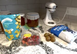
 This recipe, from Bucha Brewers, leads with a clear photo that shows the ingredients that are needed. I found this helpful to see quickly what was needed. The recipe layout is well organized and printable. The jump to recipe button improves navigation, even though the entire post is not cluttered. The author tries to make the post fun and engaging pointing out visual cues like carbonation building up in the bottle. There are links to resources and support that are subtle and unassuming offering convenience without overwhelming the reader. While the author provides the opportunity for feedback, “enjoy! Let us know if you like this one,” I do wish there had been a comment. It shows how a platform like Reddit or even Instagram shines in the opportunity it provides for users to discuss and review providing tips, variations, and troubleshooting advice.
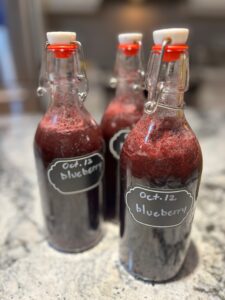 This blog prominently shows a toolbar indicating how many times the post has been pinned or shared which highlights its popularity and encourages further sharing. There are options to jump to the recipe or print which are helpful considering the lengthy post which includes videos, advertisements and descriptions. The photos are visually striking and clearly designed to be pinned. The photos make the recipe attractive and even inspired me to try this recipe. There are multiple links to other kombucha flavours and additional blueberry recipes which allow the readers to explore related content.
 This blog was quite clean also. I liked that there were clear directions indicating how much pineapple in comparison to amount of tea and what size of flip top bottles were used. Also in the method it tells how to avoid gas build up and explosions. If I search Kombucha on the blog I can see several other posts about Kombucha which gives me some hope that this author, a holistic health coach, knows what she is talking about.
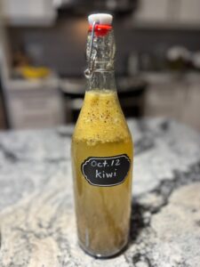 While the first two steps of the recipe were clear making it easy to follow, the blog was less polished in other areas. One of these areas is the tip about straining out the mango which is confusing since the recipe never mentions mango. This inconsistency may cause confusion for readers especially beginners. I did not like this blog as much for all of the advertisements which distract from the main content. It impacts readability and makes the page feel cluttered. I thought the background information was basic. I question the nutritional information included as fermentation consumes some sugars so the numbers may not accurately reflect the final beverage. Accuracy, clutter, and clarity in tips and nutritional claims could be improved.
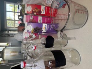
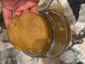
 Today felt like an ambitious day as I attempted to make four flavours for the second ferment. I wasn’t completely done. The process of making kombucha is a cycle. I needed to rehouse my original SCOBYs and start the fermentation cycle again. I am happy to report my SCOBY’s are looking good (even the
 Madison also shared with me a