Never stop learning, because life never stops teaching

Month: October 2023

Back To Basics

I had a super awesome recommendation on one of my recent posts about going down to 2 balls instead of 3 to try and get some basic fundamentals down, I think this is a great idea as I cannot get the 3rd ball into play.

  • I went down to 2 balls and practiced throwing the object to this height consistently as it was one of the basic rules that Taylor Treis discussed

  • My next task was to get the “throw, throw, catch, catch pattern down”. This was difficult for me for some reason and I wanted to throw both balls at the same time and catch them both at the same time, not good.

  • I started to get a rhythm but I could throw the balls consistently. After I got frustrated, I facetimed my girlfriend and she had a great tip for me.

  • She told me to practice against a wall so that I am forced to throw the ball in an area where I am going to catch it, without it hitting the wall. I also decided to go on my knees as I seem to be bending down to pick the balls up, way easier on the hips!

Mediascape

In Michael Wesch’s video,  he does an awesome job of explaining how the mediascape works and how everything can be connected in some shape or form. 

One of Wesch’s quotes really stood out to me. “It’s about linking people in ways that we’ve never been linked before and in ways we can’t even predict because it’s changing almost every 6 months now there’s a new tool out there that connects us in some new way”. 

If there is a new tool almost every 6 months or so, what does that mean for educators. 

The society we live in is forever evolving when it comes to the digital world, as technology evolves, us as educators should be evolving as well. The use of technology in the classroom has changed the way education is delivered and experienced. Here are a few things I found on a blog/came up with that can have a positive influence on the students. 

Enhanced Learning Resources:

  • Digital learning resources, virtual labs, e-books, and multimedia content. These resources will make learning more engaging and adaptable to individual needs.

Blended Learning Models:

  • Blended learning, which combines traditional in-person instruction with online components. Flexibility, personalization, and access to a wide range of digital resources.

Digital Collaboration:

  • Collaboration tools and platforms will enable students to work together on projects, share ideas, and connect with peers.

Online Assessments:

  • Online assessments and e-portfolios. These methods provide a more holistic view of a student’s abilities and progress.

Digital Citizenship Education:

  • Students will learn how to navigate the digital world responsibly and ethically.

Access to Diverse Learning Paths:

  • Digital platforms will make it easier for students to access a variety of learning paths and resources, breaking down traditional barriers to education.

Accessibility and Inclusivity:

  • Efforts will be made to ensure that digital resources and learning platforms are accessible to all students, regardless of their abilities, locations, or socioeconomic status

The future classroom will be a dynamic and adaptable environment that leverages the power of technology to offer engaging, personalized, and globally connected learning experiences. Educators, students, and institutions will need to embrace this digital evolution to prepare the workforce and citizens of the future effectively.

This video on Debating the Digital Future is a tad the longer side, but offers incredible insight on the balances and benefits of the new realities of technology. Here are some points I thought of that should be considered when discussing the online world. 

Online Safety and Privacy:

  • Raise awareness about online safety and privacy. Teach students how to protect their personal information, identify online threats, and practice secure online habits.

Balance Screen Time:

  • Encourage a healthy balance of screen time. Set limits on screen use and prioritize face-to-face interactions, physical activity, and time outdoors.

Wellbeing Tools:

  • Utilize digital wellbeing features and apps to monitor and manage screen time. Many devices offer tools to track and limit screen time.

Mindful Use:

  • Foster mindful technology use, encouraging individuals to be aware of their digital consumption and its impact on their well-being.

Benefits:

  • Recognize the positive aspects of technology, such as communication, learning, remote work, and access to information.

Digital Inclusion:

  • Bridge the digital divide and ensure that everyone, regardless of their economic or geographical situation, has access to the benefits of technology

Engagement:

  • Encourage community engagement both online and offline. While technology facilitates connections, it should complement, not replace, real-world relationships.

Continuous Learning:

  • Embrace a culture of continuous learning and adaptation. The digital world evolves rapidly, and staying informed and open to change is essential.

Balanced Work-Life Integration:

  • Establish a healthy work-life balance, especially in remote work settings. Set clear boundaries for working hours and downtime.

Balancing the challenges and possibilities of the digital age requires collaboration among individuals, families, educators, and employers. By prioritizing digital literacy, mindful technology use, and ethical behavior, we can harness the benefits of the digital world while easing its potential drawbacks.


Ink Scape

The Process

  • Working through some technical difficulties off the start

  • Getting my shapes into order, enjoying the opacity figured out quickly


  • Starting to come together with some layering of objects and different colors


  • Got a picture added, fought for a while to get the background edited

  • Accidentally got a cut out of myself and I ended up using it!


  • The final product!!! – The Goalie Podcast


Reflection

From figure 3 I wanted to carry over the concept of having the title as the first thing that attracts the eye. I think this design does a great job of that and it has overall balance. The same can be said about figure 1, the title is at the top of the page design and has added color to attract the eye. Working from top to bottom the text flows well and is easy to process. I took the color combo from figure 2 and made my own colors flow more freely. I tried to use the opacity tool to allow the blocks to sit over each other and blend together. 

Contrast with the colors of the jersey I am wearing for the blocks is something I wanted to focus on, which helped make up the overall layout of the design. I repeatedly used different sizes of blocks to create an appealing design, I thought it gave the design balance and a small amount of visual hierarchy. Starting with the large words at the top, followed by a picture, then moving into the buzzwords in the yellow spaces. 

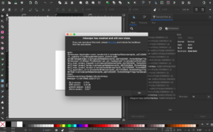
Overall the experience with inkscape was extremely beneficial, although it did crash a few times I was fortunate enough not to lose too much valuable material. I learnt my lessons quickly and saved as I went. I was able to use many different youtube tutorials to end up with my finished product. One of the most crucial tools was the one to select multiple objects and blend to create new objects, this allowed me to take my design to the next level. The bitmap tracing got a little tricky, but after lots of trial and error I finally got the background of my image blended in with the white background. This was a large headache for me and it was a huge relief when I finally solved the puzzle. 

Works Cited

Images, A. (Photographer). (February, 2022). University of Regina Goalie [Online Image]Retrieved October 3rd, 2023. Retrieved February 4, 2022 from https://arthurimages.photoshelter.com/index

Graphic Design Research

Research

Figure 1:

 Azizullah Lal

Published: February 16th 2022

This podcast cover appealed to me because of the large image and the bolded title at the top. The red behind opinion makes the cover more appealing to the eye. The movement of my eyes went from the title to the short description of the podcast. The words are slightly difficult to read but zooming in makes it better. Next my eyes travel to the time which also pops on the page, followed by the creator of the cover. The overall topography flows nicely and I want to include that in my project

Figure 2:

Muhammad Sheraz Tahir

Published: September 17th 2023

I liked this design because of the color concept and the low contrast of the design. There is a pattern to the design but it is mostly asymmetrical in the way it is laid out. The unity also gives the design a pop and is eye-catching. The use of layering colors really appeals to me.


Figure 3:

Zafeer Gul – Published: March 9th 2023 

This cover art caught my eye because of the scale that the words have compared to the pictures. The movement of my eyes went from “Night Podcast” to “Just Sit Back & Chill”. The words emphasize to the listeners to take some time from their night and sit back and enjoy learning about how to become a successful entrepreneur. The white text pops on the black background and the blue in the back gives the art a nice overall look. 


Works Cited

Figure 1. Lal, A. (Creative Designer). (February, 2022). Podcast Cover [Online Image]. Retrieved October 3rd, 2023 from        https://www.behance.net/gallery/137566463/podcast-cover?tracking_source=search_projects|podcasts+podcast+cover+art 


Figure 2. Sheraz Tahir, M. (Graphic Designer). (September, 2023). Podcast Poster Design  [Online Image]. Retrieved October 3rd, 2023 from https://www.behance.net/gallery/180208459/PODCAST-POSTER-DESIGN?tracking_source=search_projects|podcasts


Figure 3. Gul, Z. (Graphic Designer). (March, 2023). Podcast Cover Art  [Online Image]. Retrieved October 3rd, 2023 from https://www.behance.net/gallery/165575859/Podcast-Cover-Art?tracking_source=search_projects|podcasts+podcast+cover+art 


Trying iMovie

For doing video assignments in University I have always stuck to tik tok or YouTube, being a Mac owner I wanted to try out iMovie to see what it offers. I quickly found out it is super easy to use and lots of the features are premade for you, just add your content, organize, and away you go!

  • Lots of title options to pick from


  • Easy to add text and change the size


  • Complete control of where content is, and able to add transitions


In terms of use in the classroom, if there are Macs available iMovie can be a great tool for:

  • Digital Storytelling
  • Virtual Field Trips
  • Interviews
  • Peer Reviews
  • Digital Portfolios
  • Collaborative Projects

SAMR MODEL

Substitution:

At the Substitution level, iMovie could be used as a basic video playback tool. Teachers and students use it to watch educational videos or films

This level involves minimal transformation as it essentially replaces a traditional video player or DVD player

Augmentation:

At the Augmentation level, iMovie starts to enhance the learning experience. Teachers and students use basic editing features to trim or add text to videos.

For instance, students may create a simple video project where they edit together clips to summarize a historical event.

Modification:

The Modification level involves more significant changes to the learning experience. In this case, iMovie is used to create multimedia presentations or reports.

Students might create documentaries that include not only video but also images, text overlays, and music to convey complex ideas effectively.

Redefinition:

At the Redefinition level, iMovie is used to transform the way students learn and demonstrate their understanding. It enables tasks that were not possible without technology.

For example, students could collaborate on video projects with peers from other countries, conducting interviews and sharing cultural perspectives to develop a global understanding of a topic.

My Finish Product 


© 2024 Curtis Meger

Theme by Anders NorenUp ↑