Never stop learning, because life never stops teaching

Day: October 5, 2023

Ink Scape

The Process

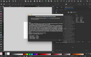
  • Working through some technical difficulties off the start
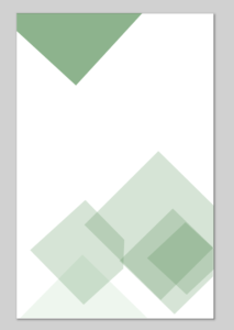
  • Getting my shapes into order, enjoying the opacity figured out quickly
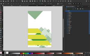
 

  • Starting to come together with some layering of objects and different colors


  • Got a picture added, fought for a while to get the background edited

  • Accidentally got a cut out of myself and I ended up using it!
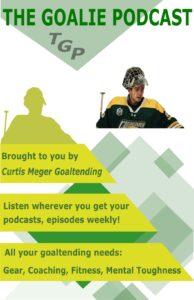
 

  • The final product!!! – The Goalie Podcast


Reflection

From figure 3 I wanted to carry over the concept of having the title as the first thing that attracts the eye. I think this design does a great job of that and it has overall balance. The same can be said about figure 1, the title is at the top of the page design and has added color to attract the eye. Working from top to bottom the text flows well and is easy to process. I took the color combo from figure 2 and made my own colors flow more freely. I tried to use the opacity tool to allow the blocks to sit over each other and blend together. 

Contrast with the colors of the jersey I am wearing for the blocks is something I wanted to focus on, which helped make up the overall layout of the design. I repeatedly used different sizes of blocks to create an appealing design, I thought it gave the design balance and a small amount of visual hierarchy. Starting with the large words at the top, followed by a picture, then moving into the buzzwords in the yellow spaces. 

Overall the experience with inkscape was extremely beneficial, although it did crash a few times I was fortunate enough not to lose too much valuable material. I learnt my lessons quickly and saved as I went. I was able to use many different youtube tutorials to end up with my finished product. One of the most crucial tools was the one to select multiple objects and blend to create new objects, this allowed me to take my design to the next level. The bitmap tracing got a little tricky, but after lots of trial and error I finally got the background of my image blended in with the white background. This was a large headache for me and it was a huge relief when I finally solved the puzzle. 

Works Cited

Images, A. (Photographer). (February, 2022). University of Regina Goalie [Online Image]Retrieved October 3rd, 2023. Retrieved February 4, 2022 from https://arthurimages.photoshelter.com/index

Graphic Design Research

Research

Figure 1:

 Azizullah Lal

Published: February 16th 2022

This podcast cover appealed to me because of the large image and the bolded title at the top. The red behind opinion makes the cover more appealing to the eye. The movement of my eyes went from the title to the short description of the podcast. The words are slightly difficult to read but zooming in makes it better. Next my eyes travel to the time which also pops on the page, followed by the creator of the cover. The overall topography flows nicely and I want to include that in my project

Figure 2:

Muhammad Sheraz Tahir

Published: September 17th 2023

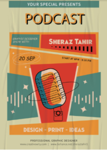
I liked this design because of the color concept and the low contrast of the design. There is a pattern to the design but it is mostly asymmetrical in the way it is laid out. The unity also gives the design a pop and is eye-catching. The use of layering colors really appeals to me.


Figure 3:

Zafeer Gul – Published: March 9th 2023 

This cover art caught my eye because of the scale that the words have compared to the pictures. The movement of my eyes went from “Night Podcast” to “Just Sit Back & Chill”. The words emphasize to the listeners to take some time from their night and sit back and enjoy learning about how to become a successful entrepreneur. The white text pops on the black background and the blue in the back gives the art a nice overall look. 


Works Cited

Figure 1. Lal, A. (Creative Designer). (February, 2022). Podcast Cover [Online Image]. Retrieved October 3rd, 2023 from        https://www.behance.net/gallery/137566463/podcast-cover?tracking_source=search_projects|podcasts+podcast+cover+art 


Figure 2. Sheraz Tahir, M. (Graphic Designer). (September, 2023). Podcast Poster Design  [Online Image]. Retrieved October 3rd, 2023 from https://www.behance.net/gallery/180208459/PODCAST-POSTER-DESIGN?tracking_source=search_projects|podcasts


Figure 3. Gul, Z. (Graphic Designer). (March, 2023). Podcast Cover Art  [Online Image]. Retrieved October 3rd, 2023 from https://www.behance.net/gallery/165575859/Podcast-Cover-Art?tracking_source=search_projects|podcasts+podcast+cover+art 


© 2024 Curtis Meger

Theme by Anders NorenUp ↑